Adding some interactivity to your R Quarto Documents

Quarto
R
Ggplot2
Published

November 30, 2022

We are so used to interactive documents that it is a pity that we do not use them in our scientific and technical reports. The fact that publishing in scientific journals is a pretty static thing (PDFs, galley proofs, etc…) does not help, since all interactivity must go to the “supplementary material”.

Example of interactive output

If your interactivity requires the computation of some R/Julia/Python code, you may need to set a server (we will talk about this on another post) and some dialog between the client (usually the browser with which you are reading together with some sort of Javascript) and the server (where the R/Julia/Python code runs).

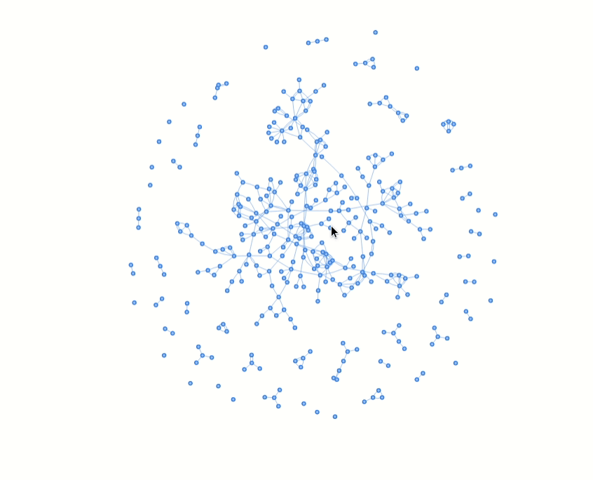
However, if your interactivity is at the end of the visualization process, you can use some interactivity that runs only on the client. With Quarto, there two three ways to achieve this, that I know of

Using htmlwidgets

There are many widgets to choose from, but my favorites are the following. I will use some data that together with some collaborators we analyzed in the papers SARS-CoV-2 transmission in students of public schools of Catalonia (Spain) after a month of reopening and The social network around influenza vaccination in health care workers: a cross-sectional study

Dynamic Tables from DT

Code
library(dplyr)
library(readr) # To read remote CSVs
df <- read_csv('https://analisi.transparenciacatalunya.cat/api/views/gi2i-axqj/rows.csv?accessType=DOWNLOAD&sorting=true',show_col_types = FALSE) %>% 
  sample_n(100)  #To see only a small sample

library(DT)
df %>%
  datatable(caption="Sample of the participating centres")

Maps with Leaflets

Leaflet is a wonderful mapping library. We can easily plot the coordinates of the sampled educational centres and produce an interactive map

Code
library(leaflet)
leaflet() %>%
  addTiles() %>%  # Add default OpenStreetMap map tiles
  addMarkers(lng=df$`Coordenades GEO X`, 
             lat=df$`Coordenades GEO Y`,
             popup = df$`Denominació completa`)

Plots with Plotly

Plotly is a widely used plotting library that produces interactive plots for dynamic documents and has bindings for R, Python, Julia and others. For instance, using the same dataset we can produce a dynamic plot. Moreover, if you are confortable with the excellent ggplot2 library you can export most of the graphs directly:

Code
library(plotly)
library(ggplot2)

g <- df %>% 
  ggplot(aes(y=`Nom comarca`,fill=`Nom naturalesa`))+
  geom_bar(position = position_dodge2())+theme_light()

ggplotly(g)

Graphs with VisNetwork

Dynamic network plots can be embedded in the document.

Code
library(igraph)
library(visNetwork)
net<-read.graph("13012_2016_522_MOESM3_ESM.graphml", format = "graphml")
data <- toVisNetworkData(net)
visNetwork(nodes = data$nodes, edges = data$edges)

Using Observable JS cells

Finally, a great addition to observable is the possibility of incorporating observable cells, which allow for Observable javascript being run on the documents. I still have to learn more about this, but in the meanwhile you can visit the documentation of the observable cells.