xx=var_a*var_aYour first Observable JS cells
After the publication of my previous post on easy interactivity of R output through htmlwidgets in quarto, I decided to redo some of the examples using one of the new additions of Quarto compared to its predecessor RMarkdown: the possibility to include observable cells.
Observable has already its own publishing platform at www.observablehq.com and, in principle, one can take any worksheet there (provided the license grants the right to do so) and include it in the quarto document. For instance, using the Inputs library from observable one can produce the following
md`The square of the value introduced **below** is ${xx}.`viewof var_a = Inputs.range([-2, 11], {value: 5, step: 1, label: "Insert a value"})This showcases the use of reactivity: cells are not executed according to the precedence in code but rather by their nonambiguous definition. No need to rerun the full notebook (this is something I remember doing again and again with other notebooks).
Combining Observable with R
Let us reproduce some of the interactivity in the visualization that we gave in the previous post but using directly javascript. The following is heavily inspired by the Palmers Penguins example in Quarto documentation.
library(tidyverse)
library(readr)
datA<-read_csv('./journal.pone.0251593.s002.csv',show_col_types = FALSE) %>%
  mutate(Exposure=Students.Weeks.1.and.2)
datB<-read_csv('./Directori_de_centres_docents_TRA_ACOVID._Curs_2020-2021.csv',show_col_types = FALSE) %>%
  rename(CODCENTRE=`Codi centre`)

library(magrittr)
colnames(datB) %<>% str_replace_all("\\s", "_")


datR<-left_join(datA,datB)  %>%
  relocate(Denominació_completa,Nom_comarca,Type.of.School,Enrolled.Students)

ojs_define(datOJS = datR)
The last command ojs_define() transforms the R data datR to some that can be read in OJS cells as seen later. Moreover, it is necessary to transpose the data and manipulate it with the correct column names.
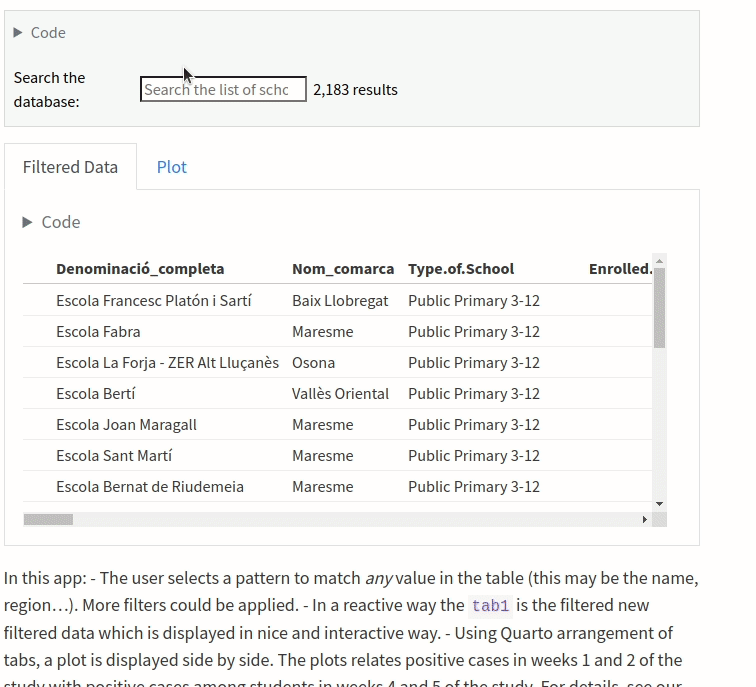
dat=transpose(datOJS)For instance, we are going to create the following visualization (you can unfold the code clicking at the code icon):
Code
viewof filteredOJS= Inputs.search(dat,
{
  placeholder: "Search the list of schools",
  datalist: dat.map(d => d.Name_of_School),
  label: "Search the database: "
})Code
viewof tab1= Inputs.table(filteredOJS)Code
Plot.plot({
  marks: [
    Plot.arrow(tab1, {
      x1: 1,
      y1: "TOTAL.Weeks.1.and.2",
      x2: 2,
      y2: "Students.Weeks.4.and.5",
      stroke: d=>d.Exposure,
      strokeWidth: 1,
      bend: true
    })
  ]
})
In this app: - The user selects a pattern to match any value in the table (this may be the name, region…). More filters could be applied. - In a reactive way the tab1 is the filtered new filtered data which is displayed in nice and interactive way. - Using Quarto arrangement of tabs, a plot is displayed side by side. The plots relates positive cases in weeks 1 and 2 of the study with positive cases among students in weeks 4 and 5 of the study. For details, see our paper SARS-CoV-2 transmission in students of public schools of Catalonia (Spain) after a month of reopening.
My first impressions are very good and probably it is a very convenient way to present data in an interactive and smooth way.